Learn to talk to your designer or printer like a pro!
Researched by Joel Mielke
There are many different kinds and parts that make up the shapes of type characters (which are also called fonts) This article is a helpful way to identify what those parts and shapes are called. Each letter may have many "parts" of its anatomy. The glossary and pictorial anatomy of type below will help you talk with your graphic designer and printer and speed your project along.
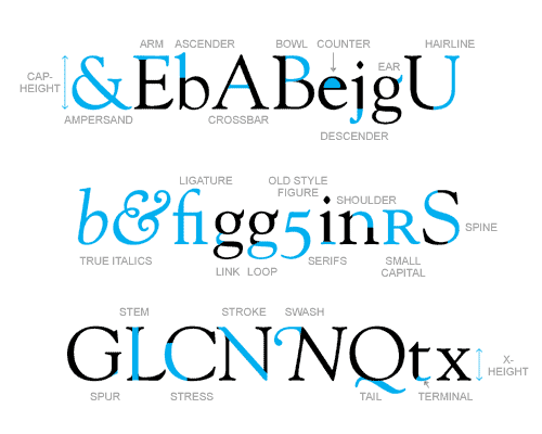
Ampersand A ligature formed from an upper or lowercase e conjoined with t which spells et (“and” in Latin).
Arm A horizontal stroke that is free on one end.
Ascender The part of the lowercase letters b, d, f, h, k, l, and t, that extends above the height of the lowercase x.
Bar The horizontal stroke in the A, H, e, t and similar letters.
Bowl/Eye A curved stroke which makes an enclosed space.
Counter The fully or partially enclosed space within a character.
Descender The part of the letters g, j, p, q, y, and sometimes J, that extends below the baseline.
Ear The small stroke projecting from the top of the lowercase g.
Hairline A thin stroke usually common to serif typestyles.
Italics A cursive alphabet which is matched with a roman font and used along chiefly for emphasis.
Ligature Characters conjoined in order to avoid overlap and clumsy spacing. Common ligatures are: fi and fl
Link The stroke connecting the top and bottom of a lowercase g.
Loop The lower portion of the lowercase g.
Old-Style Figures Lower case numbers which are employed, almost invisibly, in body copy.
Serif A stroke added as a stop to the beginning and end of the main strokes of a character.
Shoulder The curved stroke of the h, m and n.
Small Caps Upper case type designed at the lower case height in an extended font family. Used for acronyms, initialisms and abbreviations in normal text.
Spine The main curved stroke of a lowercase or capital S.
Spur A small projection off a main stroke; found on many capital Gs.
Stem A main stroke that is more or less straight, not part of a bowl. The letter o has no stem; The letter l consists of a stem and serifs alone.
Stress The direction of thickening in a curved stroke.
Stroke A straight or curved diagonal line.
Swash A flourish replacing a terminal or serif.
Tail The descender of Q or short diagonal stroke of the R.
Terminal The end of a stroke not terminated with a serif.
X-height The height of the lowercase letters excluding ascenders and descenders.
Thanks for reading our glossary of type -- we hope you found it informative.