Editing content in Drupal is done by a WYSIWYG editor (what you see is what you get). This allows for a more visual method of editing content that is similar to using a word editor. Hovering over a toolbar button will give you a brief description of its use.
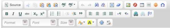
Most of these buttons are simple, however a few require extra steps.
"Paste As Plain Text" and "Paste From Word"
 The "Paste As Plain Text" and "Paste From Word" buttons are useful for copying and pasting content from another webpage or from a word document. When content is copied and pasted into the editor it often comes with font and styling tags that will hardcode the content to be a specific font and size. Using these buttons removes that formatting so that you can use the WYSIWYG editor controls to format your content.
Images

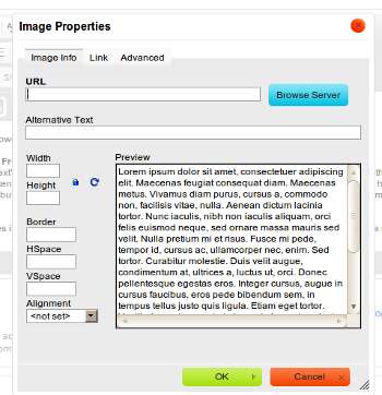 Uploading and inserting images into your content is done through the image button. Clicking this button will open up a new dialog box labeled "Image Properties". From here you can put in a URL to an image, or you can click the blue "Browse Server" button in order to view/select/upload images on the web server where your website is located. Once you select an image (browse server button covered below) you can set the various options.
- Alternative Text: This is text that will show if the image doesn't load properly. Most useful for visually impaired users that rely on the text to describe the image content.
- Width / Height: You can specify the width and height of the image in pixels. This can also be achieved by selecting the image in the editor and using the resize boxes on the edges to drag your image to the desired dimensions.
- Border: Putting a value here will create a solid color border (default black, can be programmed to any color) with a thickness in pixels.
- HSpace: Puts padding to the left and right of your image, value in pixels. Useful if your text is appearing to touch the image.
- VSpace: Same as HSpace but top and bottom.
- Alignment: Can be set Left or Right. The image will then appear all the way to the left or right, and text will flow around the image instead of having a single line of text.
- Link Tab: At the top the link tab allows you to turn the image into a link. You can also accomplish this by selecting the image and using the link button in the toolbar.
- Advanced Tab: This tab is used for HTML and CSS settings.
Tables
 The tables button brings up the table creation menu. Specify the number of columns and rows and the width of the table. Once your table is created you can add content into the various cells. Sometimes adding content into one cell will squish the empty ones so that it is difficult to select them to put more content in. You can put the cursor into one cell and use the arrow keys on your keyboard to move the cursor over into the next cell. You can also modify the table by right clicking on the table to bring up the advanced menu which allows you to change table properties, insert more columns and rows, etc.
Links
 The lin
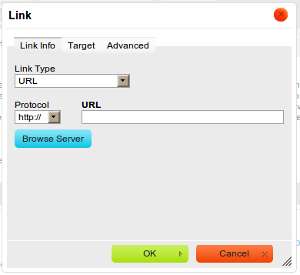 k button allows you to turn any selected content into a link. You can simply put in the address to the website you are linking to. However, if you are linking to a page on your own website you can change the Protocol dropdown to "other" and then you only need the page title (with spaces replaced by hyphens). You can find out the page-name by going to the page you are linking to and copying the part of the URL after your domain.
Example: www.example.com/page-name
You would only need to put page-name into the URL for the link and not the www.example.com.
You can use the "Target" tab to have the link open in a new window, same window, etc. The advanced tab is for HTML and CSS settings.