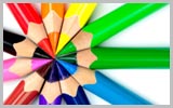
Business, Sales and the World Wide Web Are In Color
 Color is a meaningful constant for sighted people and it's a powerful psychological tool. By using color psychology, you can send a positive or negative message, encourage sales, calm a crowd, or make an athlete pump iron harder.
Employ the latest color psychology in all facets of marketing and particularly in logo design, web site design, the cover of a book, or the package of a product.
The field of industrial psychology has a sub-field that studies only the psychology of color. It is no accident that Campbell's soup has used the same four colors on their labels for years and years. When I mentioned that product, I'll bet an image of that label popped into your head.
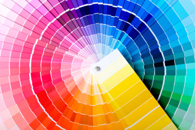
Below is a quick overview of the meaning of basic colors in the Western Hemisphere. This information will help you decided what colors to use in your marketing projects. The psychology of color changes with lighter or darker shades of the colors below, which are often associated with much different meanings. Also remember for the World Wide Web, that different cultures have differing views on the meaning of color.
If you have further questions about color psychology, contact us at 707-725-0804 or by email.
 |
Psychology of Color: Black
Black is the color of authority and power, stability and strength. It is also the color associated with intelligence (doctorate in black robe; black horn rimmed glasses, etc.) Black clothes make people appear thinner. It's a somber color sometimes associated with evil (the cowboy in the black hat was almost always the "bad guy"). In the western hemisphere black is associated with grieving. Black is a serious color that evokes strong emotions; it is easy to overwhelm people with too much black.
|
 |
Psychology of Color: White
For most of the world this is the color associated with purity (wedding dresses); cleanliness (doctors in white coats) and the safety of bright light (things go bump in the night ... not the bright sunshine!). It is also used to project the absence of color, or neutrality. In some eastern parts of the world, white is associated with mourning. White is also associated with creativity (white boards, blank slates). It is a compression of all the colors in the color spectrum.
|
 |
Psychology of Color: Gray
Gray is most associated with the practical, timeless, middle-of-the-road, solid things in life. Too much gray leads to feeling mostly nothing; but a bit of gray will add that rock solid feeling to your product. Some shades of gray are associated with old age, death, taxes, depression or a lost sense of direction. Silver is an off-shoot of gray and often associated with giving a helping hand, strong character (sterling in-fact!).
|
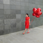 |
Psychology of Color: Red
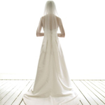
If you want to draw attention, use red. It is often where the eye looks first. Red is the color of energy. It's associated with movement and excitement. People surrounded by red find their heart beating a little faster and often report feeling a bit out of breath. It's the absolute wrong color for a baby's room but perfect to get people excited. Wearing red clothes will make you appear a bit heavier and certainly more noticeable (some studies show red cars get more tickets but that may be because the red car owners drive faster or the ticket giver notices the movement of the red car more prominently). Red is not a good color to over use but using a spot of red in just the right place is smart in some cases (one red accent in an otherwise neutral room draws the eye; a red tie with a navy blue suit and a white shirt adds just the right amount of energy to draw the eye (no wonder it's the "uniform of the day" at the seats of government). Red is the symbol of life (red blooded life!) and, for this reason, it's the color worn by brides in China. Red is used at holidays that are about love and giving (red roses, Valentines hearts, Christmas, etc.) but the true color of love is pink. Pink is the most calming of all colors -- often our most dangerous criminals are housed in pink cells as studies show that the color drains energy and calms aggression. Think of pink as the color of romance, love, and gentle feelings, to be in the pink is to be soothed.
|
 |
Psychology of Color: Blue
Ask people their favorite color and a clear majority will say blue. Much of the world is blue (skies, seas). Seeing the color blue actually causes the body to produce chemicals that are calming; but that isn't true of all shades of blue. Some shades (or too much blue) can send a cold and uncaring message. Many bedrooms are blue because it's calm, restful color. Over the ages blue has become associated with steadfastness, dependability, wisdom and loyalty (note how many uniforms are blue). People tend to be more productive in a blue room because they are calm and focused on the task at hand. Some studies are showing that weight lifters can lift more weight in a blue gym - in fact, nearly all sports are enhanced in blue surroundings.
|
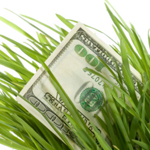 |
Psychology of Color: Green
The color of growth, nature, and money. A calming color also that's very pleasing to the senses. Dark forest green is associated with terms like conservative, masculine and wealth. Hospitals use light green rooms because they are found to be calming to patients. It is also the color associated with envy, good luck, generosity and fertility. It is the traditional color of peace, harmony, comfortable nurturing, support and well paced energy.
|
 |
Psychology of Color: Yellow
Cheerful yellow is the color of the sun, associated with laughter, happiness and good times. A person surrounded by yellow feels optimistic because the brain actually releases more seratonin (the feel good chemical in the brain) when around this color. It is the color associated with optimism but be careful with yellow; when intense, it is the color of flames and studies show babies cry more in (bright) yellow rooms and tempers flare more around that color too. It has the power to speed up our metabolism and bring out some creative thoughts (legal tablets are yellow for good reason!). Yellow can be quickly overpowering if over-used, but used sparingly in the just the right place it can be an effective tool in marketing to greater sales. Some shades of yellow are associated with cowardice; but the more golden shades with the promise of better times.
|
|
|
Psychology of Color: Orange
The most flamboyant color on the planet! It's the color tied most this fun times, happy and energetic days, warmth and organic products. It is also associated with ambition. There is nothing even remotely calm associated with this color. Orange is associated with a new dawn in attitude.
|
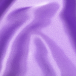 |
Psychology of Color: Purple
What color were the robes of kings and queens? Yes, they were purple, our most royal color that is associated with wealth, prosperity, rich sophistication. This color stimulates the brain activity used in problem solving. However, when overused in a common setting it is associated with putting on airs and being artificial. Use purple most carefully to lend an air of mystery, wisdom, and respect. Young adolescent girls are most likely to select nearly all shades of purple as their favorite color.
|
 |
Psychology of Color: Brown
This color is most associated with reliability, stability, and friendship. More are likely to select this as their favorite color. It's the color of the earth itself "terra firma" and what could represent stability better. It too is associated with things being natural or organic. Caution however, for in India it is the color of mourning.
|
Basics on How to Use Color Together
Color psychology is complicated field of study and goes deep into the meaning of combining colors for a particular desired effect. We will broad brush some basics that may well enough for you to make good color choices for a web site with marketing in mind.
Monochromatic Color Scheme This is the use of a single color in varying shades. This can be a clean and interesting look on a web site. It's soothing and pleasing to the eye especially in the blue or green hues.
Complimentary Color Scheme This is using high contrast of color by selecting colors directly opposite from one another on the color wheel (such as pink and lime green). This puts a warm color with a cool color and is pleasing to the eye.
Triple Color Scheme This scheme uses three colors equally spaced from each other around a color wheel. It's popular with web designers and allows for a harmonious color scheme.
You ARE that first flash of color seen on your web site. It's important to remember that color is the first thing registered by a person who goes to your site. If that is pleasing, they will read on -- if it's displeasing you may lose them in a nano second. So first select your background color and then select two other colors for your web site. Remember to keep in mind the meaning and harmony of colors.
Recommended Reading on Color:
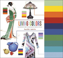 Title: Living Colors: A Definitive Guide to Color Palettes Through the Ages
Author: Margaret Walch
Publisher: Chronicle Books (1995)
Comments: Spiral bound work book; shows 80 classic color schemes from art and design history.
 Title: The Designers Guide to Color Combinations: 500+ Historic and Modern Color Formulas in CMYK*
Author: Leslie Cabarga
Publisher: North Light Books (2003)
Comments: This author doesn't teach color theory or even provide a color wheel in this book; but the book does contain a large collection of color combinations that work together and ways to use color together.